Showing posts with label logos. Show all posts

Monday, 7 September 2015

DJ P.Y.K


Bomi from DJ P.Y.K approached me as he was after a logo redesign. His ideas were quite well formed to begin with, he wanted elements from his old logo included (such as the broken record, the headphones, the ankh and the lettering), but also wanted a caricature portrait drawn in a cartoonish style with an attitude-filled expression (he sent plenty of references). He requested that the design was "bold, intricate and controversial" so that it drew people to it and made them want to find out more about his music and brand. You can find out more about DJ P.Y.K here: DK P.Y.K on Soundcloud | DJ P.Y.K on Twitter.

Monday, 29 June 2015

Green Bottle Press


This is the final logo created for startup poetry publisher Green Bottle Press. I was commissioned by my faves Bookswarm, who I've worked with multiple times in the past. They were responsible for the overall brand design and web development, so I worked closely with them to create a logo that exactly suited the needs of our client.

Friday, 20 February 2015

lily & frank


fun little logo design for new start-up business lily & frank, a vintage accessories company. the client wanted portraits of the two main characters (the swallow and the dog) to be included, and wanted the main text to be simple and tall. i'm really fond of the colour scheme of this one.

the cider drinker


logo design for youtube-based cider connoisseur and reviewer the cider drinker.

Friday, 19 December 2014

paper plane films


never one to turn away a hand lettering project, here is the final logo i created for sparkly new wedding videography company paper plane films, based in essex. they provided me with examples of typography they liked, and i created something as close to the examples as possible, obviously making it totally individual to the company using hand drawn type.

Sunday, 31 August 2014

lamarsh layers


a little logo design for a side project of regular client of mine.

Tuesday, 10 September 2013

THREE HARES PUBLISHING


a simple and earthy logo design for a new publishing company. more details to come.

STICKY FINGERS CO


a sweet and sugary logo created as a rebrand for cake company sticky fingers co.

Thursday, 16 May 2013

PERCY'S PRINT


i recently finished working on a branding and illustration project for a new company specialising in custom stamps. i got to create the brand identity as well as design a whole range of stamps, so not only was it a lovely new challenge as i'd never done anything of the sort before, it was also lovely to work so closely with the owner and see the brand develop as our ideas did. i'm waiting until it's up-and-running until i upload it to my proper portfolio, but for now, here is the logo. i can't wait to share more at a later date!

Thursday, 28 March 2013

elves & ovens


i've just recently wrapped up a big illustration project working with elves and ovens, producing a logo and illustrations for their new website. they are a children's party and catering/events company, and were an absolutely treat to work with. you can view the whole project on my portfolio here, or visit their website where you can view the illustrations in situ here.

Monday, 25 February 2013

FEBRUARY

february has been one of those strange months that you expect to be really quiet and then everything sneaks up on you and you suddenly find yourself at the end of the month thinking what the hell just happened and why is my face so grey. my day job has been manic, and my freelancing has been manic. i can't complain, being this busy leaves me feeling exhausted but extremely content at feeling like i've actually accomplished something.


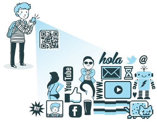
so let me show you what i've been working on this month. the illustration above is taken from a project i started working on with matthew knight called the a-z of technology. the project is a blog collaboration, wherein each week matthew writes an article on a particular technology, and i illustrate it.


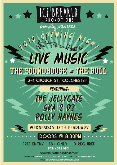
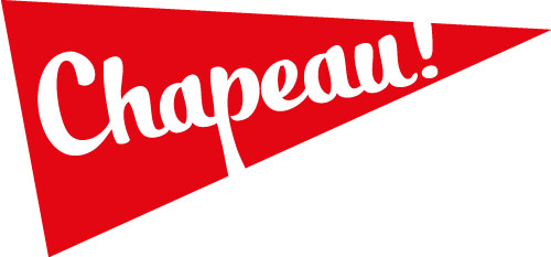
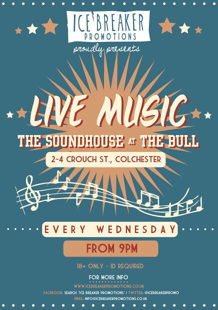
ABOVE: here's a cheeky little flyer i made for them lovely boys over at ice breaker promotions. yes, i'm hugely biased, but they've been successfully hosting gigs for and promoting local and student bands for over two years now, that one must give credit where credit's due.

ABOVE: a fun logo i was asked to create for crafty up-cyclers cheeky tiki island. their creations are beautiful, daft and completely unique, i highly recommend a little visit!


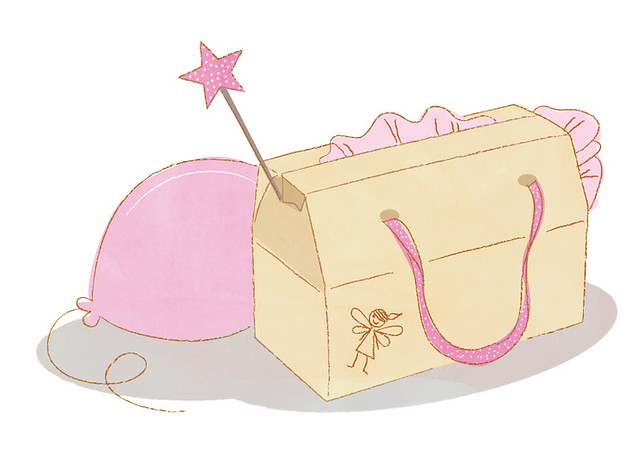
ABOVE: le gasp! a tiny preview of a private commission i was asked to make earlier this month. that's all you're getting of that one for now ;)


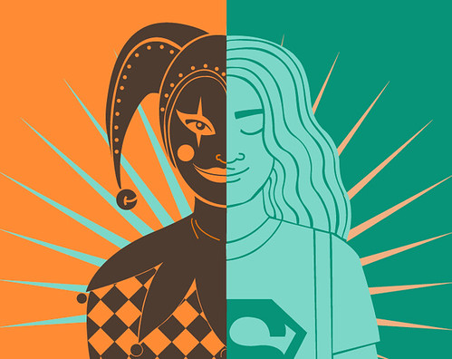
ABOVE: something a little way away from my usual style...an illustration produced for a 2-in-1 split poster design for lakeside theatre. see the full poster design here on my portfolio.


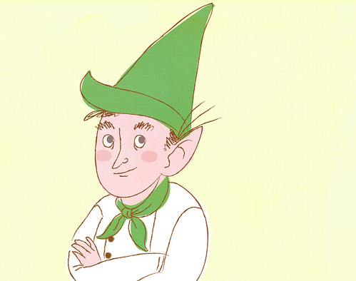
ABOVE: lastly for now, a little character from a big project i've just begun with elves and ovens, as part of a brand overhaul.

as well as that, in the last week i have also taken on two other projects, one branding/logo based and the other band merch based, but i'll wait until i've finished them to show them off :) thank you for reading - phew!

Wednesday, 2 January 2013

JOLLITIES

here is a little post dedicated briefly to the labels i designed for the christmas hampers jack & i made for our families last month. not really a thing, but i had fun creating these so i wanted to share them.
we made everything from scratch - limoncello, tomato chutney, strawberry jam, marshmallow twizzlers and loads more. it was the first time we had made a lot of these, but everything turned out superbly and our parents loved their gifts :)


Saturday, 20 October 2012

LITTLE RUBY RED


a logo i was commissioned by little ruby red to design. they wanted a fun pin up and alternative bridal feel to the logo, with pops of red.

little ruby red creates unique wedding cake toppers - whether they are wee portraits of the couple or your favourite cult characters. i highly recommend you have a browse of their excellent gallery - i am particularly fond of the rocky horror toppers!

Sunday, 30 September 2012

SPRINTERS TRAVEL


earlier this week i completed a logo for an eco-friendly minibus/coach company called sprinters travel. their only request was that it included a cheetah and the colour purple. they was keen for it to reflect a retro theme, which i obtained with a 50s-inspired font and the "speed" lines.

also can i just say: they were an utter joy to work with! i don't think i have ever experienced a smoother project from beginning to end. you can visit sprinters travel here, or like them on facebook here.

Wednesday, 19 September 2012

ALL YOU NEED IS A LITTLE...


i recently finished off a logo design for a new shop opening soon in colchester that describes itself as:
"a little home at the end of crouch street for new gifts, nearly news, vintage clothes, greeting cards, bits, bobs all served with a cuppa."
i don't know about you, dear reader, but that sounds chuffin' lovely!
you can view the full logo as well as some of my development work in my portfolio here.

Monday, 17 September 2012

HELLES BELLES!


helles belles are a newly formed burlesque troupe set up in colchester. i attended their first show at the judge & jury in july and they blew me away - i couldn't stop grinning the entire time. the four ladies are so different in style, personality and performance but they work so wonderfully together, and i've never seen a group of people have so much fun on a stage.

needless to say, i was so inspired by their energy and performance that i wanted to illustrate them all and their unique styles. above is also a hand drawn logo i knocked up. you can see the entire project here on my portfolio.

Friday, 6 July 2012

KELLI SAVILL: ONLINE JOURNALIST


awesome person and sex-writer extraordinaire kelli savill approached me last week asking for a logo that she can use to promote herself as an online journalist at events and online. she was un utter breeze to work with, her only request being that we avoided the colour pink.

the result was a soft and fun hand-drawn logo, in a blue gradient to match her magical hair. you can read kelli's wonderfully funny and honest articles over here: kellisavill.co.uk.

CHAPEAU!


i recently finished collaborating with the creative co-op on a logo design as part of a rebrand for coffee & bike shop chapeau!

the creative co-op took charge of the creative direction, whilst i was involved with the illustrative side of the project.

chapeau! recently opened in colchester in the hopes to bring together people passionate about bikes, community and coffee. read more about them here: chapeauvelo.co.uk

i put this project on my portfolio, where you can also see photos of it in action.

Tuesday, 22 May 2012

lions, dragons and type...oh my!

last month i successfully packed twenty-four years of my life into many boxes and moved into a flat with my boyfriend, jack, and now we're finally (almost) settled and i am well and truly saddled up and back on the ol' freelance horse. hello again!

and so, for now, here's a few bits and bobs that i have been working on...(what's that? a blog post that has no real narrative and is just a mish-mash of drawings? what a surprise).

here's a bonkers thing: i was shortlisted with a few other artists to potentially help with the rebrand of one of my favourite magicians/comedians/mythical creature piff the magic dragon (i was lucky enough to catch his show at the edinburgh fringe last year - he is truly daft and puts on a wonderfully grumpy performance - please do look him up if you don't know of him). nothing has been confirmed yet & it probably won't happen but to be emailed was enough. very chuffed! the above illustration was a sample i submitted.

i was also approached by euston estate, as they needed to update their logo (their current one can be seen on their website...)

as it turned out, my style wasn't what they were after so unfortunately i couldn't see the job through to the end (can't win 'em all, eh!) but this is one example of what i produced for them.


finally for now: mentor me. this is a project that not only am i involved in (as one of the mentors), but have also had a part to play in the branding of it. marc of the creative co-op asked me to design the logo as well as the hand-drawn type that accompanies the mentor photographs on the website. this is a seriously lovely and important project to be a part of, and i'm very grateful that i am.

Tuesday, 13 March 2012

mid-march


just a quick little post. i wish i could be more careful with this blog rather than using it as a dumping ground. i guess it is just something i need to practice and be more disciplined with.

first up (top image, and below) is a logo and flyer for the up-and-coming junk jamboree in colchester. i am genuinely gutted that i won't be around for the event (i have to be at work at the shop), it looks like it's going to be so cute!


second up is another flyer for them lovely fellas at ice breaker promotions (i may be a little biased) - they recently took on the very exciting move to a shiny new venue in town (RELAUNCH TOMORROW!) so they wanted a new flyer to go with it. jack & gary are doing absolute wonders for the town's local music scene & i'm super proud of them, as well as really chuffed to be a little part of it.


lastly, and i hate to be one of those illustrators who are all like I AM WORKING ON SUCH A COOL PROJECT RIGHT NOW BUT I CAN'T SHOW YOU, but. you guys. i am working on such a cool project right now but, and i'm sorry, but i can't show you (not at least until it's finished and what-not). but here's a preview! you know those jobs where you can't believe this is a job because you're enjoying it so much? yeah, that.


i'm not taking on any more commissions for the next month or so as i'm (fingers crossed) moving out next month and want the transition to be as smooth and stress free as possible, so things may be a little quiet around here. rest assured i will be back and hopefully (maybe) if i'm a lucky, with a fancy new studio space! ta-ra!