Saturday 20 October 2012

BOOK HUGGER: PREVIEW


here is a sneak preview of a big ol' project i've been working on for the last few months. the client is bookhugger, an online literary magazine.

i was approached to create illustrated portraits of the contributing crew of authors and writers. i've so far done fifteen portraits, with more to come. i will eventually upload them onto my main portfolio over at tinysketchbook.com, but for now i just wanted to show a little preview of the project, because i've had such a lovely time working on it, and they've been a wonderful client to work with.

LITTLE RUBY RED


a logo i was commissioned by little ruby red to design. they wanted a fun pin up and alternative bridal feel to the logo, with pops of red.

little ruby red creates unique wedding cake toppers - whether they are wee portraits of the couple or your favourite cult characters. i highly recommend you have a browse of their excellent gallery - i am particularly fond of the rocky horror toppers!

Sunday 30 September 2012

THE VIOLET


i was asked by a friend to illustrate the poem the violet by jane taylor for a private gift commission.

i used a font called 'print clearly' for the body text as i felt it's simple nature would compliment the decorative hand drawn lettering and illustrated elements well.

MORE BELLES!


a new poster design for the lovely ladies of helles belles burlesque, and their up-and-coming solo show at the judge & jury in october. if you're in the essex area and didn't get the opportunity to attend their previous show, i can highly recommend it for a smashing night out. they certainly know how to throw a party!
you can find out more about the belles by visiting their facebook page here.

SPRINTERS TRAVEL


earlier this week i completed a logo for an eco-friendly minibus/coach company called sprinters travel. their only request was that it included a cheetah and the colour purple. they was keen for it to reflect a retro theme, which i obtained with a 50s-inspired font and the "speed" lines.

also can i just say: they were an utter joy to work with! i don't think i have ever experienced a smoother project from beginning to end. you can visit sprinters travel here, or like them on facebook here.

Wednesday 19 September 2012

CHEERS!


a little illustration i made tonight as part of a poster design. all will be revealed soon!

ALL YOU NEED IS A LITTLE...


i recently finished off a logo design for a new shop opening soon in colchester that describes itself as:
"a little home at the end of crouch street for new gifts, nearly news, vintage clothes, greeting cards, bits, bobs all served with a cuppa."
i don't know about you, dear reader, but that sounds chuffin' lovely!
you can view the full logo as well as some of my development work in my portfolio here.

Tuesday 18 September 2012

GRAPHICS WORM


last month i took part in a collaborative art piece called the twitter graphics worm.

the project was set up by graphic designer/theatre technician lloyd evans as a way to connect illustrators, artists, photographers and any sort of creative using a wide variety of styles and mediums.

the only rules are the work must be at specific dimensions, and the piece you create must give the illusion that the work before and after yours is seamlessly blended.

i took inspiration from the chunky arrows of the previous piece to create a sort of tribal tiki mask, and made it up from there.


if you are interested in taking part, you can sign up here.

Monday 17 September 2012

HELLES BELLES!


helles belles are a newly formed burlesque troupe set up in colchester. i attended their first show at the judge & jury in july and they blew me away - i couldn't stop grinning the entire time. the four ladies are so different in style, personality and performance but they work so wonderfully together, and i've never seen a group of people have so much fun on a stage.

needless to say, i was so inspired by their energy and performance that i wanted to illustrate them all and their unique styles. above is also a hand drawn logo i knocked up. you can see the entire project here on my portfolio.

NEW ICEBREAKER WORK


two more poster designs, as part of my ongoing work for colchester's greatest band promoters icebreaker promotions.

Tuesday 31 July 2012

V BAR T-SHIRT DESIGN: REVEALED!


here is the finished t-shirt design i made for v bar (commissioned by where i work, my icon art, to do so).

you can see more photographs over at my portfolio here.

Friday 6 July 2012

KELLI SAVILL: ONLINE JOURNALIST


awesome person and sex-writer extraordinaire kelli savill approached me last week asking for a logo that she can use to promote herself as an online journalist at events and online. she was un utter breeze to work with, her only request being that we avoided the colour pink.

the result was a soft and fun hand-drawn logo, in a blue gradient to match her magical hair. you can read kelli's wonderfully funny and honest articles over here: kellisavill.co.uk.

V BAR T-SHIRT DESIGN: PREVIEW


this is a little peek at an illustration i recently finished for cocktail bar v bar. it was designed as a two colour screen print to be printed onto dark coloured t-shirts. i will post the whole design, plus photographs of the finished shirts real soon!

PREVENTION TOWN CHARITY DINNER


a poster i knocked up for a dinner & auction event that kids charity prevention town are hosting in november. the only restrictions were that it had to include the brand colours blue, white & black (as is the logo).

CHAPEAU!


i recently finished collaborating with the creative co-op on a logo design as part of a rebrand for coffee & bike shop chapeau!

the creative co-op took charge of the creative direction, whilst i was involved with the illustrative side of the project.

chapeau! recently opened in colchester in the hopes to bring together people passionate about bikes, community and coffee. read more about them here: chapeauvelo.co.uk

i put this project on my portfolio, where you can also see photos of it in action.

Wednesday 27 June 2012

BOOGIE WONDERLAND?


i drew a silly dancing lady tonight whilst working on some actual work. it's made me want to make a little series about how different drinks affect your behaviour (particularly on the dance floor - i love drawing people gettin' down and shaking their tail feather, if you hadn't already noticed).

i know that i certainly enjoying a punching my fist in the air when i've had a rum cocktail or two (see fig. a)

now might be a good time to mention i gave my portfolio an overhaul a few weeks ago: tinysketchbook.com

Monday 18 June 2012

DRINK LIKE A FISH


isn't the illustration process a strange thing? you start with an idea in your head about how you want something to look. so...sketch. erase. sketch. erase. sketch. lightbox. ink. scan. play around for an hour. decide on a colour scheme. play around a bit longer. then realise that there is no way that it will ever work like you want it to. my goal this evening was to design a two-colour screen print for a run of t-shirts for v bar, in colchester, but because my idea wasn't working the way i wanted it to, i made this instead.

a blue-skined, slightly zombie-esque (shudder) martini-drinking pin-up inspired young lady.

back to the drawing board, as they say.

Tuesday 12 June 2012

WALT & WINNIE'S WONDROUS WORDS!


i only found this out two days ago by accident, but a children's educational book i illustrated over a year ago has been published!

it's called Walt & Winnie's Wondrous Words and it's written by Charlie Chaleco. it's described as "a new approach to learning vocabulary - a sure way of building up a huge memory bank of wondrous words". it was a huge project to work on (the book is 100 pages long), a totally new experience and learning curve.

you can buy it from amazon HERE.

Wednesday 6 June 2012

UNCONTAINED - HIGH SPIRITS PT. II


and so the colourful army of paper-shaped positivity took over the little store in box park and if the only thing we achieved today was making someone passing by glance in and smile to themselves, then that was all we wanted.

what a jolly fun day :) thanks again to shellsuitzombie for the opportunity and to 55dsl for hosting us and for being generally top chaps, and anyone who popped by to make a bird.

(i forgot my camera memory card. these photos were taken on an old blackberry phone, ha.) EDIT: shellsuit have just published a lovely write-up of the day, including some far superior photos. read it here.

Sunday 3 June 2012

UNCONTAINED - HIGH SPIRITS


"In June and July, ShellsuitZombie is taking over the 55DSL store in BOXPARK, Shoreditch, and getting thirty creative individuals, groups and companies to take a day each.

The lucky few will not only get a blank box in which to create or show off whatever they want to but also get a feature in the next issue of ShellsuitZombie magazine which goes out at the end of May.

We will have everything from illustrators and creative directors to live bands and festivals, all in one place. This won’t just be another exhibition - workshops, parties, creative get-togethers and crowd participation are not only encouraged but expected."


i was super chuffed to be asked by shellsuitzombie to take part in UNCONTAINED this month. i worked with them last year at the D&AD and have gone to various events they've hosted - they're basically the coolest and nicest people in the creative industry, and can throw a damn good party to boot.

my favourite designer/thinker heather and i are going to be spending our day (wednesday 6th june) folding, creasing and stringing up a flock of tiny colourful birds containing messages of positivity and happiness. it sounds over-the-top hippy, i know, but our intention is to create a bright and happy, constantly evolving environment that anyone can walk into and contribute towards.

find out a little bit more about what we will be doing here.

we would love everyone to get involved so even if you can't pop along on the day to write/draw/make, we'll be using the hashtag #highspirits on the run up to and including the day itself for you to submit your happy thoughts. we'll make them fly for you!

Tuesday 22 May 2012

lions, dragons and type...oh my!

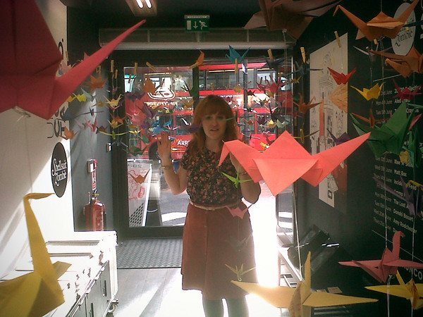
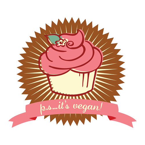
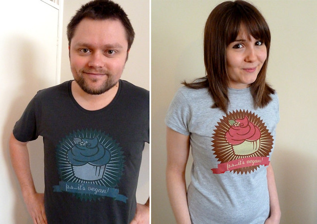
last month i successfully packed twenty-four years of my life into many boxes and moved into a flat with my boyfriend, jack, and now we're finally (almost) settled and i am well and truly saddled up and back on the ol' freelance horse. hello again!

and so, for now, here's a few bits and bobs that i have been working on...(what's that? a blog post that has no real narrative and is just a mish-mash of drawings? what a surprise).

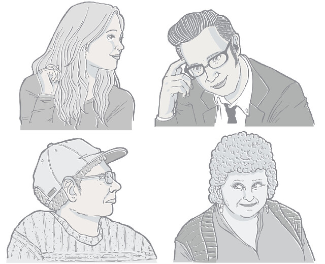
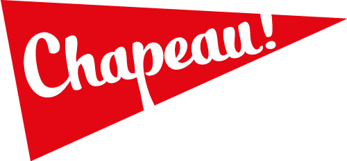
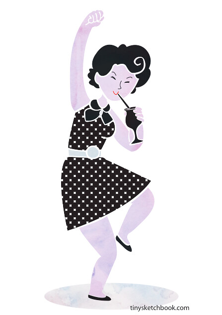
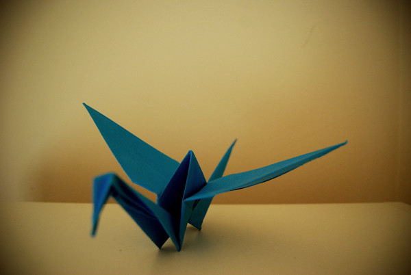
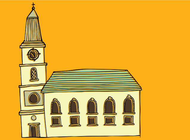
here's a bonkers thing: i was shortlisted with a few other artists to potentially help with the rebrand of one of my favourite magicians/comedians/mythical creature piff the magic dragon (i was lucky enough to catch his show at the edinburgh fringe last year - he is truly daft and puts on a wonderfully grumpy performance - please do look him up if you don't know of him). nothing has been confirmed yet & it probably won't happen but to be emailed was enough. very chuffed! the above illustration was a sample i submitted.

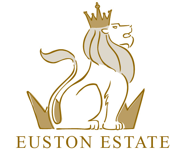
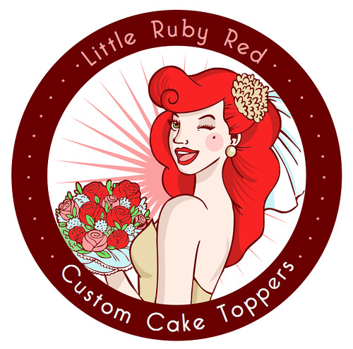
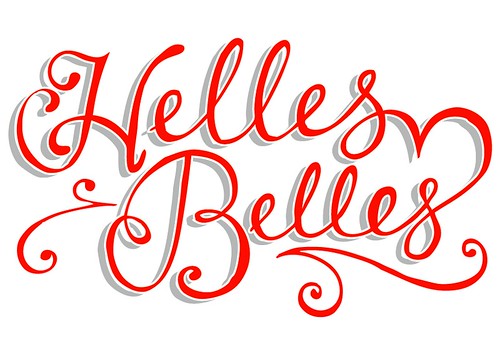
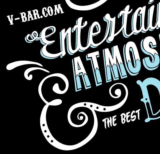
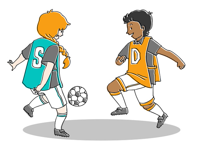
i was also approached by euston estate, as they needed to update their logo (their current one can be seen on their website...)

as it turned out, my style wasn't what they were after so unfortunately i couldn't see the job through to the end (can't win 'em all, eh!) but this is one example of what i produced for them.
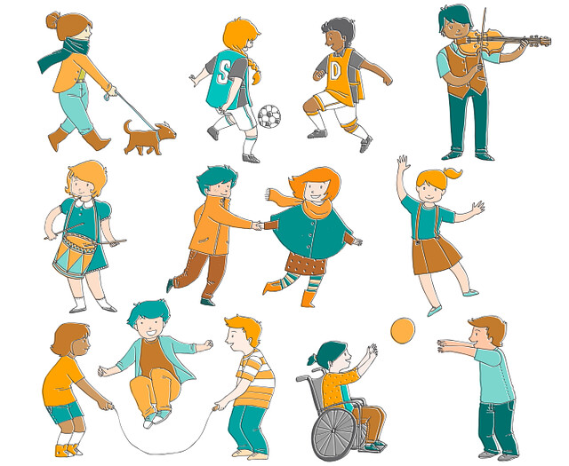
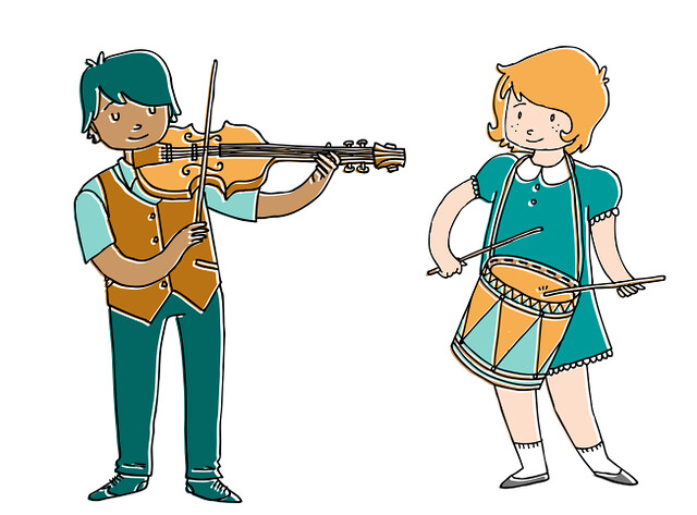


finally for now: 
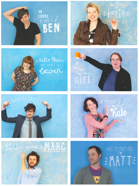
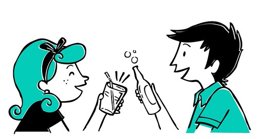
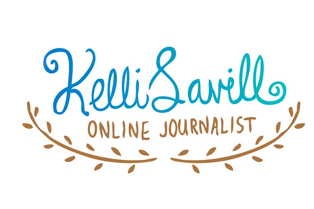
mentor me. this is a project that not only am i involved in (as one of the mentors), but have also had a part to play in the branding of it. marc of the creative co-op asked me to design the logo as well as the hand-drawn type that accompanies the mentor photographs on the website. this is a seriously lovely and important project to be a part of, and i'm very grateful that i am.

Tuesday 13 March 2012

mid-march


just a quick little post. i wish i could be more careful with this blog rather than using it as a dumping ground. i guess it is just something i need to practice and be more disciplined with.

first up (top image, and below) is a logo and flyer for the up-and-coming junk jamboree in colchester. i am genuinely gutted that i won't be around for the event (i have to be at work at the shop), it looks like it's going to be so cute!


second up is another flyer for them lovely fellas at ice breaker promotions (i may be a little biased) - they recently took on the very exciting move to a shiny new venue in town (RELAUNCH TOMORROW!) so they wanted a new flyer to go with it. jack & gary are doing absolute wonders for the town's local music scene & i'm super proud of them, as well as really chuffed to be a little part of it.


lastly, and i hate to be one of those illustrators who are all like I AM WORKING ON SUCH A COOL PROJECT RIGHT NOW BUT I CAN'T SHOW YOU, but. you guys. i am working on such a cool project right now but, and i'm sorry, but i can't show you (not at least until it's finished and what-not). but here's a preview! you know those jobs where you can't believe this is a job because you're enjoying it so much? yeah, that.


i'm not taking on any more commissions for the next month or so as i'm (fingers crossed) moving out next month and want the transition to be as smooth and stress free as possible, so things may be a little quiet around here. rest assured i will be back and hopefully (maybe) if i'm a lucky, with a fancy new studio space! ta-ra!

Friday 2 March 2012

KIDS Gala


i've been really excited to tell everyone about this project, and it finally got signed off to print last week so i can finally share it! i've really enjoyed working on this.

last year the lovely nial of harrington moncrieff asked if i would provide the illustrations for an invite and programme for the kids charity KIDS 2012 fundraising gala. i loved the little challenge of working with a strict colour palette to echo the KIDS branding.

if i manage to get my hands on copies of the finished items i'll be sure to share them.


Friday 17 February 2012

nom nom nom


last month i was asked by locally based vegan-friendly and frankly delicious baking geniuses p.s...it's vegan! to revamp their logo. i thoroughly enjoyed working with company owner jen to produce a sugary sweet and fun logo that i like to think it reflects their personality and cakes all in one.

they even got the final result printed on t-shirts (from my beaut of a workplace), which jen & her husband were kind enough to model: