Showing posts with label hand drawn typography. Show all posts

Friday, 20 February 2015

the cider drinker


logo design for youtube-based cider connoisseur and reviewer the cider drinker.

Friday, 19 December 2014

paper plane films


never one to turn away a hand lettering project, here is the final logo i created for sparkly new wedding videography company paper plane films, based in essex. they provided me with examples of typography they liked, and i created something as close to the examples as possible, obviously making it totally individual to the company using hand drawn type.

Sunday, 31 August 2014

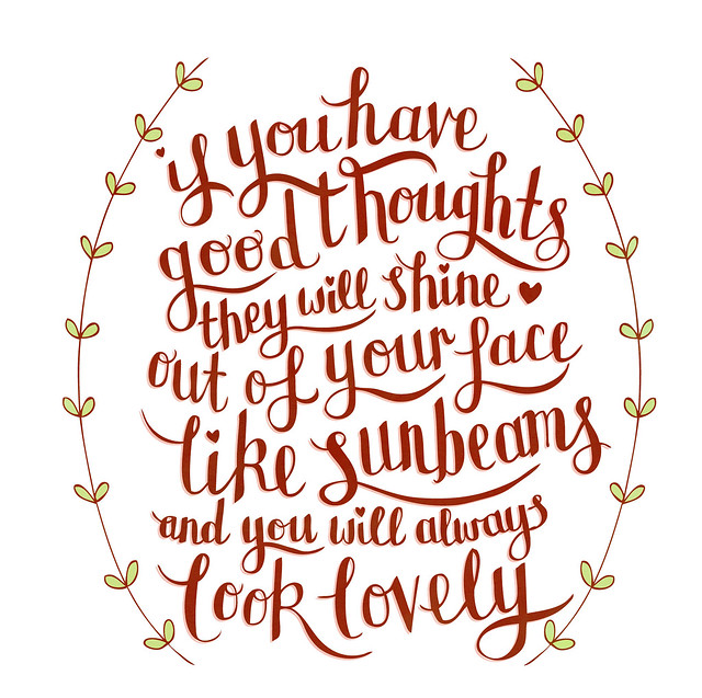
sunbeams

some more hand drawn typography, this time a quote from roald dahl.

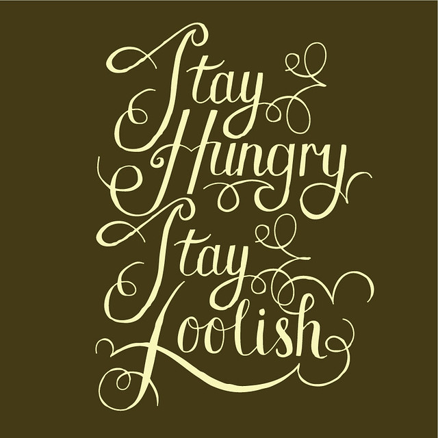
stay hungry, stay foolish

the beginnings of a new project based on inspirational quotes. all hand drawn typography, edited in illustrator. see more over on my portfolio here.

Tuesday, 10 September 2013

BRAVE AS LOVE


a logo design and rebrand for the cake topper loveliness that is brave as love.

YELLOW SUBMARINE


yellow submarine inspired wall mural painted at twisters bar.

THREE HARES PUBLISHING


a simple and earthy logo design for a new publishing company. more details to come.

STICKY FINGERS CO


a sweet and sugary logo created as a rebrand for cake company sticky fingers co.

Wednesday, 2 January 2013

LANDSLIDE


i was more than pleased to help out when local charity the robin cancer trust asked me to submit a piece of art for an auction to help raise money. the brief was completely open and we could produce whatever we wanted. i chose to illustrate a line from fleetwood mac's landslide.
the auction itself was postponed from last year until this year. watch this space.

Sunday, 30 September 2012

THE VIOLET


i was asked by a friend to illustrate the poem the violet by jane taylor for a private gift commission.

i used a font called 'print clearly' for the body text as i felt it's simple nature would compliment the decorative hand drawn lettering and illustrated elements well.

Wednesday, 19 September 2012

ALL YOU NEED IS A LITTLE...


i recently finished off a logo design for a new shop opening soon in colchester that describes itself as:
"a little home at the end of crouch street for new gifts, nearly news, vintage clothes, greeting cards, bits, bobs all served with a cuppa."
i don't know about you, dear reader, but that sounds chuffin' lovely!
you can view the full logo as well as some of my development work in my portfolio here.

Friday, 6 July 2012

KELLI SAVILL: ONLINE JOURNALIST


awesome person and sex-writer extraordinaire kelli savill approached me last week asking for a logo that she can use to promote herself as an online journalist at events and online. she was un utter breeze to work with, her only request being that we avoided the colour pink.

the result was a soft and fun hand-drawn logo, in a blue gradient to match her magical hair. you can read kelli's wonderfully funny and honest articles over here: kellisavill.co.uk.

V BAR T-SHIRT DESIGN: PREVIEW


this is a little peek at an illustration i recently finished for cocktail bar v bar. it was designed as a two colour screen print to be printed onto dark coloured t-shirts. i will post the whole design, plus photographs of the finished shirts real soon!

CHAPEAU!


i recently finished collaborating with the creative co-op on a logo design as part of a rebrand for coffee & bike shop chapeau!

the creative co-op took charge of the creative direction, whilst i was involved with the illustrative side of the project.

chapeau! recently opened in colchester in the hopes to bring together people passionate about bikes, community and coffee. read more about them here: chapeauvelo.co.uk

i put this project on my portfolio, where you can also see photos of it in action.

Tuesday, 22 May 2012

lions, dragons and type...oh my!

last month i successfully packed twenty-four years of my life into many boxes and moved into a flat with my boyfriend, jack, and now we're finally (almost) settled and i am well and truly saddled up and back on the ol' freelance horse. hello again!

and so, for now, here's a few bits and bobs that i have been working on...(what's that? a blog post that has no real narrative and is just a mish-mash of drawings? what a surprise).

here's a bonkers thing: i was shortlisted with a few other artists to potentially help with the rebrand of one of my favourite magicians/comedians/mythical creature piff the magic dragon (i was lucky enough to catch his show at the edinburgh fringe last year - he is truly daft and puts on a wonderfully grumpy performance - please do look him up if you don't know of him). nothing has been confirmed yet & it probably won't happen but to be emailed was enough. very chuffed! the above illustration was a sample i submitted.

i was also approached by euston estate, as they needed to update their logo (their current one can be seen on their website...)

as it turned out, my style wasn't what they were after so unfortunately i couldn't see the job through to the end (can't win 'em all, eh!) but this is one example of what i produced for them.


finally for now: mentor me. this is a project that not only am i involved in (as one of the mentors), but have also had a part to play in the branding of it. marc of the creative co-op asked me to design the logo as well as the hand-drawn type that accompanies the mentor photographs on the website. this is a seriously lovely and important project to be a part of, and i'm very grateful that i am.

Sunday, 31 July 2011

hand drawn typography


"fighting like a soldier, over skinny jeans and pic'n'mix"

hand drawn typography inspired by polly scattergood's lovely song 'please don't touch'.